Mark Gray's "Ancient Land"
My Landscape
Mark's is obviously much better than mine, but they both have the same basic principles. A wide, nature landscape in a desert.
Tuesday, April 21, 2015
Friday, April 17, 2015
Wednesday, April 15, 2015
Wednesday, April 1, 2015
Photo Touch Ups
Clone Stamp Tool
Spot Healing Brush
I liked the spot healing brush much more. It was easier to use and didn't have to blur the image.
Spot Healing Brush
I liked the spot healing brush much more. It was easier to use and didn't have to blur the image.
Thursday, March 26, 2015
Action Photos
I used the sport mode on the camera for all of these pictures. I had my sister and my dog play around our yard and took pictures of them moving. The sport mode takes pictures super fast so I ended with almost 60 pictures and I found the best 6.
Friday, March 20, 2015
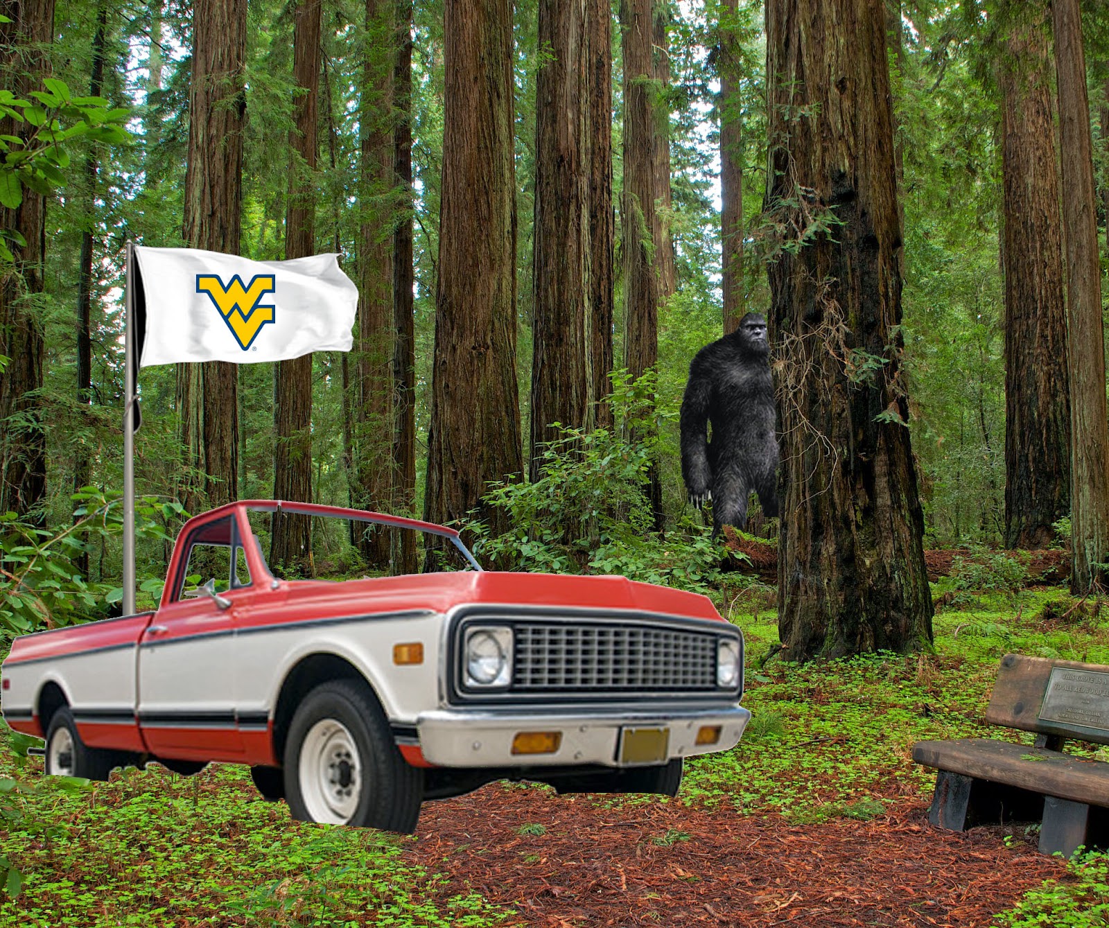
Photoshop Final
I started with the background and photoshopped in Bigfoot. I put him back in the trees by selecting the trees and moving them forward. Then I photoshopped in the truck and the flag.
Monday, March 16, 2015
Triptych
For the triptych I chose the theme of my jeep. I took pictures from the front, back and back tire of the jeep. There's no deeper meaning in these photos, I just like the way jeeps look. I thought I could find some cool angles to take pictures of the jeep from. I was able to bring up the contrast and bring down the brightness to make the jeep stand out much better against the background.
Diptych
My diptych is of my cat, Seven, and my dog, Mo. The diptych fits the theme of polar opposites in the sense that they are cat and dogs, usually know as opposite animals. However they are also opposites in what they are doing. My cat is sleeping and doesn't look very happy to see me, while my dog is running around and looks to be enjoying himself. While playing with the contrast I was able to make half the background lighter than the other side. I put my dog on the lighter side because he's more lively than the cat.
Cool Colors
The gum wrappers are cool blue colors and the sheet is a cool grey. I rotated the gum packages into a pattern on the sheet before I took the picture to make it more interesting.
Monochromatic
I used the similar colors of the carpet and my pile of khakis for a monochromatic picture, everything is a shade of tan or brown. Because of the level I had with the carpet you can see the texture in parts of it, so i used that that.
Bright Vs. Dull
I used the bright orange of the Frisbee and the dull blues of the backpack in this photo. This photo also used contrast. The Frisbee and the backpack and that to the white wall.
5 Ways to make my photography better
1. Learn a new lighting technique. Lighting can make an okay photo, good. I'm not that great at using lighting in my pictures so they'd be much better if I tried to do something more creative with lighting.
2. Listening to my favorite music. Listening to music when trying to take a photograph might help me come up with a more creative picture. I could imagine what a music video might look like and try to take a picture like it was a still from the video.
3. Shoot at a sporting event. If I shot at a sporting event, especially one on a field where I could walk all the way around I could easily work on angles, lighting and action photos.
4. Take on a photo assignment. If I keep doing my class assignments we work on a lot of good skills for photography, even if it isn't the focus of the assignment I can still work on all my skills.
5. Shooting in the dark. Shooting with almost no light would help me because i would have to figure out ways to use flash or other light sources. It would help me learn to use light which I don't use that often.
Thursday, March 12, 2015
30 Photos that changed the world article
The first photo I looked at was number 8, Raising the Flag on Iwo Jima. This photo was taken during World War Two during the battle of Iwo Jima. It is easily one of the most recognizable pictures of WWII if not of all time. I liked how much detail is in the picture without there being any color. The second photo that I chose to look at was number 11, Earthrise. It is a picture of the earth rising above the moon. It is one of the first pictures taken of the earth from the moon. It is important because it shows how small the earth really is compared to the rest of space. The third photo I looked at was number 30, Tetons and the Snake River. I thought this photo looked amazing. Its just a mountain and a river but it looks awesome in black and white. It doesn't need color to be cool. My favorite part about it is the lighting. The sun is coming up behind the mountain with the clouds looks really cool and lights up the whole valley and river.
Tuesday, March 10, 2015
Monday, March 2, 2015
Tuesday, February 24, 2015
Portraits
I took the portraits of my sisters. I chose their backgrounds because they weren't boring, but they weren't distracting. I used the flash for my main lighting to bring out my sisters rather than the backgrounds.
Thursday, February 12, 2015
Friday, February 6, 2015
Thursday, February 5, 2015
Subscribe to:
Comments (Atom)


